Reading Cinematic Light: Direction, Contrast, and Color

Concise Answer
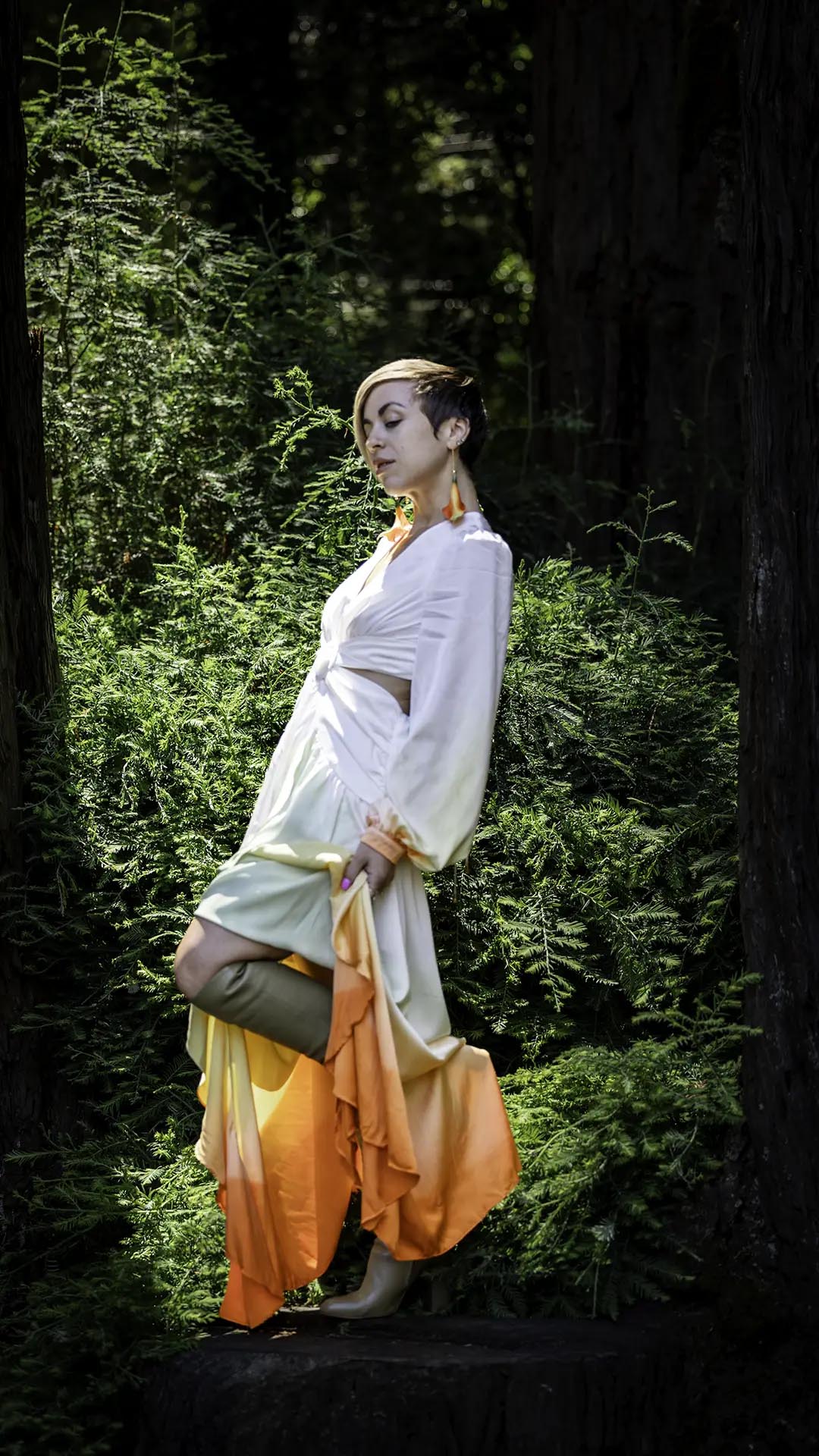
Cinematic lighting uses direction, contrast, color, and motivated sources to reveal emotional meaning without making a real person feel artificial. The viewer should notice presence and atmosphere before noticing equipment. The practical objective is to shape believable light so a portrait feels like a frame from a larger story. Start with the existing light, decide what the viewer should notice first, and add only the control needed to make that intention readable.
This short answer to Reading Cinematic Light: Direction, Contrast, and Color matters because lighting vocabulary can become detached from photographs. A named pattern is useful when it helps diagnose direction, contrast, or falloff. It is not a requirement to force every face into the same geometry. In FSTOP’s cinematic realism, technique supports presence: atmosphere has weight, but the person remains believable.
What What Is Cinematic Lighting Should Accomplish
The viewer should notice presence and atmosphere before noticing equipment. That standard separates meaningful lighting from decoration. The source, shadow, background, and color should feel as though they belong to the same moment, even when the photograph uses several fixtures or substantial control outside the frame.
Before placing equipment for Reading Cinematic Light: Direction, Contrast, and Color, write one sentence describing the emotional and practical job of the portrait. Name the intended crop, final use, subject movement, and environmental detail that must remain visible. This brief prevents an attractive test frame from becoming the wrong answer for the assignment.
The Core Lighting Controls
Key direction
For Reading Cinematic Light: Direction, Contrast, and Color, key direction is a visible decision rather than a setting copied from a diagram. Change one variable at a time and watch the transition across the face, clothing, and environment. The useful question is not whether the source looks dramatic from behind the camera; it is whether the resulting hierarchy directs attention to the person and supports shape believable light so a portrait feels like a frame from a larger story.
Test key direction at the final camera position because a small move can alter catchlights, shadow edges, reflections, and background separation. Then compare it with shadow density. Those controls interact: correcting one by increasing power may create a second problem that placement, flagging, or subject position would solve more cleanly.
Shadow density
For Reading Cinematic Light: Direction, Contrast, and Color, shadow density is a visible decision rather than a setting copied from a diagram. Change one variable at a time and watch the transition across the face, clothing, and environment. The useful question is not whether the source looks dramatic from behind the camera; it is whether the resulting hierarchy directs attention to the person and supports shape believable light so a portrait feels like a frame from a larger story.
Test shadow density at the final camera position because a small move can alter catchlights, shadow edges, reflections, and background separation. Then compare it with source motivation. Those controls interact: correcting one by increasing power may create a second problem that placement, flagging, or subject position would solve more cleanly.
Source motivation
For Reading Cinematic Light: Direction, Contrast, and Color, source motivation is a visible decision rather than a setting copied from a diagram. Change one variable at a time and watch the transition across the face, clothing, and environment. The useful question is not whether the source looks dramatic from behind the camera; it is whether the resulting hierarchy directs attention to the person and supports shape believable light so a portrait feels like a frame from a larger story.
Test source motivation at the final camera position because a small move can alter catchlights, shadow edges, reflections, and background separation. Then compare it with color continuity. Those controls interact: correcting one by increasing power may create a second problem that placement, flagging, or subject position would solve more cleanly.
Color continuity
For Reading Cinematic Light: Direction, Contrast, and Color, color continuity is a visible decision rather than a setting copied from a diagram. Change one variable at a time and watch the transition across the face, clothing, and environment. The useful question is not whether the source looks dramatic from behind the camera; it is whether the resulting hierarchy directs attention to the person and supports shape believable light so a portrait feels like a frame from a larger story.
Test color continuity at the final camera position because a small move can alter catchlights, shadow edges, reflections, and background separation. Then compare it with background separation. Those controls interact: correcting one by increasing power may create a second problem that placement, flagging, or subject position would solve more cleanly.
Step-by-Step Setup
Define the frame. For Reading Cinematic Light: Direction, Contrast, and Color, choose the camera height, crop, background, and subject mark before fine lighting adjustments. Light can only be judged against the composition it must serve.
Record the ambient baseline. For Reading Cinematic Light: Direction, Contrast, and Color, make a frame with added sources off. Note practical highlights, window direction, color casts, reflective surfaces, and the darkest area in which useful detail must remain.
Build the primary source. In Reading Cinematic Light: Direction, Contrast, and Color, place the key according to the intended expression and face angle. Set direction and distance before power; moving a source changes quality and falloff, while power alone changes only quantity.
Shape what the key cannot solve. During Reading Cinematic Light: Direction, Contrast, and Color, use a flag, negative fill, reflector, curtain, grid, or second source only after naming the problem. Keep each tool responsible for one understandable job.
Bring in the subject. For Reading Cinematic Light: Direction, Contrast, and Color, recheck key direction and shadow density with real posture, hair, wardrobe, glasses, and movement. A stand-in can establish exposure, but it cannot reveal the final human details.
Test expression and movement. Within Reading Cinematic Light: Direction, Contrast, and Color, capture neutral, subtle, and more active variations. Watch whether the lighting remains coherent when the chin, shoulders, hands, or eyeline move away from the original mark.
Document the final state. After Reading Cinematic Light: Direction, Contrast, and Color, save a clean reference frame and record exposure, white balance, power, distances, modifier orientation, and ambient conditions. Photograph the set from above or from both sides when the spatial relationship is difficult to describe.
This sequence keeps Reading Cinematic Light: Direction, Contrast, and Color adjustable. If the result fails, return to the last successful frame instead of changing several fixtures at once. Controlled iteration produces stronger judgment and makes a successful setup repeatable for another person, location, or production day.
A Real-World Portrait Scenario
Consider a window-side portrait in a rain-darkened Portland interior. Begin by deciding which environmental clues must remain visible and what emotional register the subject should carry. Establish an exposure that protects those clues, then place the subject where the existing direction already supports the intended face angle.
For this Reading Cinematic Light: Direction, Contrast, and Color scenario, build the smallest possible intervention. Use key direction to establish the face, refine source motivation so the frame retains depth, and check background separation before increasing output. Make a neutral frame before introducing color, haze, diffusion, or a pronounced edge.
While making Reading Cinematic Light: Direction, Contrast, and Color, direct the person while watching the light rather than treating expression as a separate phase. A pause, lowered chin, rotated shoulder, or step toward the source can change both psychological tone and exposure. The strongest frame joins gesture and illumination so neither feels pasted onto the other.
Exposure, Color, and Skin
Exposure for Reading Cinematic Light: Direction, Contrast, and Color should protect the brightest meaningful surface while retaining enough shadow information for the intended finish. Read the face, then check light clothing, reflective makeup, glasses, metallic accessories, practical bulbs, and bright background openings. A technically recoverable highlight may still look false or distracting.
For Reading Cinematic Light: Direction, Contrast, and Color, set a stable white balance when several frames must match. If mixed color is part of the design, decide which source should render neutral and which source is allowed to shift. Evaluate color on skin, white wardrobe, and neutral surfaces; a pleasing background color can still contaminate the jaw or eye socket.
Do not use underexposure as a shortcut to atmosphere in Reading Cinematic Light: Direction, Contrast, and Color. Dense shadows can hold emotional weight while retaining believable transitions and texture. Capture a neutral reference when using gels or unusual practicals so the final grade has an honest point of comparison.
Directing a Person Inside the Light
During Reading Cinematic Light: Direction, Contrast, and Color, show the subject the physical working area rather than asking them to remain frozen on a tiny mark. Explain which movements are safe, which direction keeps the eyes in the light, and whether a turn changes the shadow pattern. Clear visual direction reduces technical interruptions and supports natural presence.
For Reading Cinematic Light: Direction, Contrast, and Color, watch the transition frames. Expression often becomes most believable between formal poses, but those moments remain usable only if the lighting tolerates a breath, weight shift, or small head turn. Build enough latitude for human movement unless a deliberately narrow beam is essential to the story.
Common Mistakes and Corrections
Flat illumination
In Reading Cinematic Light: Direction, Contrast, and Color, flat illumination weakens the frame because it disconnects technique from the subject or scene. Diagnose it by making a neutral reference frame, switching off the most recent source, and comparing the face, edge, and background separately. A smaller positional correction is usually more believable than adding another light. Correction 1 should preserve texture and expression while restoring a clear source hierarchy.
Unmotivated effects
In Reading Cinematic Light: Direction, Contrast, and Color, unmotivated effects weakens the frame because it disconnects technique from the subject or scene. Diagnose it by making a neutral reference frame, switching off the most recent source, and comparing the face, edge, and background separately. A smaller positional correction is usually more believable than adding another light. Correction 2 should preserve texture and expression while restoring a clear source hierarchy.
Crushed skin detail
In Reading Cinematic Light: Direction, Contrast, and Color, crushed skin detail weakens the frame because it disconnects technique from the subject or scene. Diagnose it by making a neutral reference frame, switching off the most recent source, and comparing the face, edge, and background separately. A smaller positional correction is usually more believable than adding another light. Correction 3 should preserve texture and expression while restoring a clear source hierarchy.
Mixed color without intent
In Reading Cinematic Light: Direction, Contrast, and Color, mixed color without intent weakens the frame because it disconnects technique from the subject or scene. Diagnose it by making a neutral reference frame, switching off the most recent source, and comparing the face, edge, and background separately. A smaller positional correction is usually more believable than adding another light. Correction 4 should preserve texture and expression while restoring a clear source hierarchy.
Background brighter than the face
In Reading Cinematic Light: Direction, Contrast, and Color, background brighter than the face weakens the frame because it disconnects technique from the subject or scene. Diagnose it by making a neutral reference frame, switching off the most recent source, and comparing the face, edge, and background separately. A smaller positional correction is usually more believable than adding another light. Correction 5 should preserve texture and expression while restoring a clear source hierarchy.
Image and Diagram Plan
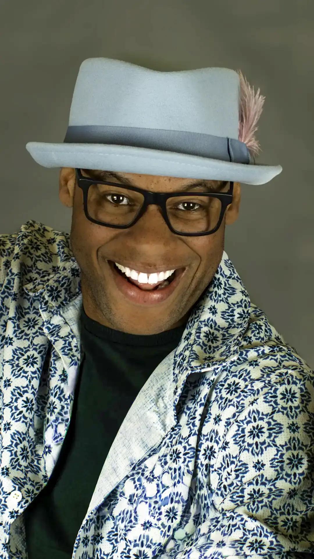
ORIGINAL IMAGE SLOT: Filename: `cinematic-lighting-finished-portrait.jpg`. Alt text: "Finished portrait demonstrating what is cinematic lighting with controlled facial detail and environmental depth."
ORIGINAL DIAGRAM SLOT: Filename: `cinematic-lighting-lighting-diagram.svg`. Alt text: "Overhead lighting diagram for what is cinematic lighting showing camera, subject, sources, modifiers, and flags."
ORIGINAL BTS SLOT: Filename: `cinematic-lighting-behind-the-scenes.jpg`. Alt text: "Behind-the-scenes view of a what is cinematic lighting setup with source placement and spill control visible."
The three Reading Cinematic Light: Direction, Contrast, and Color image slots should be filled only with original FSTOP photographs or diagrams. The finished image explains the result, the diagram explains spatial relationships, and the behind-the-scenes frame demonstrates experience. Together they provide stronger evidence than decorative stock photography.
Related Lighting Guides and Services
Build outward from Reading Cinematic Light: Direction, Contrast, and Color in stages: begin with Three-Point Lighting Explained, compare the adjacent decision in High-Key vs Low-Key Lighting, and strengthen intermediate control with Hard Light vs Soft Light. For a more advanced application, continue to Rembrandt Lighting Guide; then use Three-Light Commercial Setup as a practical diagnostic or production reference.
After Reading Cinematic Light: Direction, Contrast, and Color, return to the Cinematic Lighting for Portrait Photography pillar guide for the complete framework connecting direction, contrast, color, catchlights, depth, flash, natural light, and visual psychology.
The Reading Cinematic Light: Direction, Contrast, and Color approach also applies to cinematic acting headshots and fashion photography. For a Portland session, use the service page to compare the intended photographs, preparation needs, and production scope before choosing equipment or a visual treatment.
Frequently Asked Questions
How can I tell where cinematic key light is coming from?
Study catchlights, nose and jaw shadows, highlight placement, and the falloff across the face. Then compare those clues with windows, lamps, sky, or other visible sources in the frame.
Does what is cinematic lighting require expensive equipment?
No. For Reading Cinematic Light: Direction, Contrast, and Color, the central skill is controlling direction, size, distance, spill, and exposure. A window, lamp, inexpensive LED, reflector, curtain, or black card can teach the same relationships before specialized equipment becomes necessary.
How do I know when the lighting looks cinematic?
The image should suggest a believable world beyond the frame, preserve human presence, and use light to organize emotion and space. A color effect or dark exposure alone does not make what is cinematic lighting cinematic.
What camera setting should I choose first?
For Reading Cinematic Light: Direction, Contrast, and Color, choose shutter speed from subject movement and flash synchronization, aperture from the required depth of field, then ISO from the remaining exposure. Lock white balance when color continuity matters and verify important highlights with the histogram or waveform.
How should what is cinematic lighting change for different faces?
Adapt Reading Cinematic Light: Direction, Contrast, and Color by adjusting the face angle, source height, fill, and camera position after observing bone structure, glasses, hair, skin response, and expression. Lighting patterns are starting points; the person is the evidence used to refine them.
Can I use this approach outdoors in Portland?
Yes. Treat sky, sun, buildings, wet pavement, foliage, and storefronts as existing sources or flags. Establish the ambient frame first, then add or subtract light only where shape believable light so a portrait feels like a frame from a larger story requires more control.
What should I record after the setup works?
After a successful Reading Cinematic Light: Direction, Contrast, and Color setup, photograph the set from the camera and subject positions; note distances, heights, modifier orientation, power, exposure, white balance, and ambient conditions. Record why the decisions worked, not only the equipment list.